
The layout of your social feed plays a huge role in how your website looks and feels.
A well-chosen layout can:
- Make your website look modern
- Improve user engagement
- Highlight your best content
- Match your brand identity
With Easy Social Feed, you have multiple layout options that you can customize using Skins and the Live Preview Customizer.
In this guide, we’ll explain how to choose and manage feed layouts like Grid, Masonry, and more.
Why Feed Layouts Matter
Different layouts serve different purposes.
For example:
- A clean grid works great for Instagram galleries
- A masonry layout feels dynamic and modern
- A carousel layout fits perfectly in sidebars
- A full-width layout is ideal for homepages
Choosing the right layout improves visual appeal and usability.
Where to Change Feed Layouts
To manage layouts:
For Facebook:
Go to Easy Social Feed → Facebook → Skins
For Instagram:
Go to Easy Social Feed → Instagram → Skins
Click Edit on an existing Skin or create a new one.
Inside the Live Preview Customizer, you’ll find the Layout Settings section.
This is where you control how your feed appears.
Common Layout Options Explained
Let’s break down the most commonly used layouts.
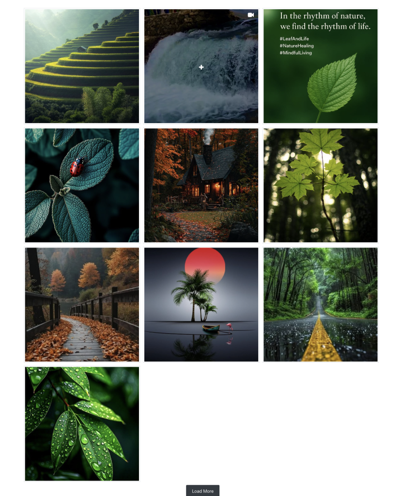
Grid Layout
The Grid layout displays posts in equal-sized columns.
Best For:
- Instagram feeds
- Clean website designs
- Portfolio-style displays
- Product showcases
Benefits:
- Balanced structure
- Easy to scan
- Works well on all devices
- Looks organized and professional
You can adjust:
- Number of columns
- Spacing between posts
- Post alignment
Grid is the safest and most versatile layout.
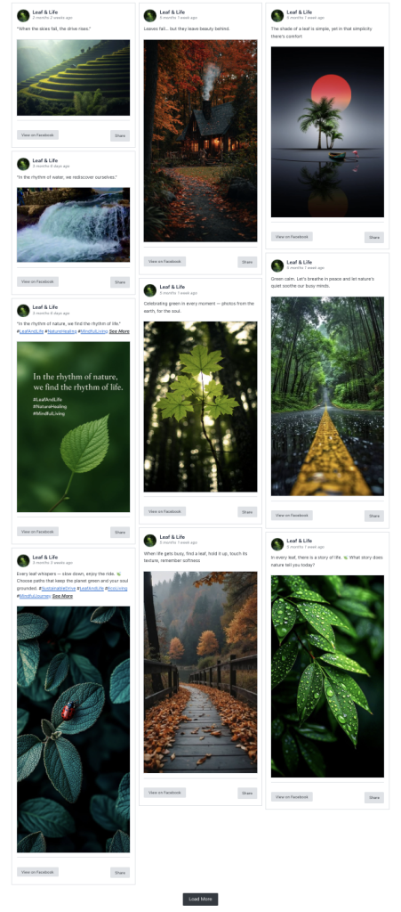
Masonry Layout
Masonry layout arranges posts dynamically based on content height.
Instead of forcing equal rows, it stacks posts naturally.
Best For:
- Mixed image sizes
- Facebook feeds with varied content
- Creative or blog-style websites
Benefits:
- Modern look
- Eliminates empty space
- Visually engaging
- Feels dynamic
Masonry works especially well when posts have different image sizes.
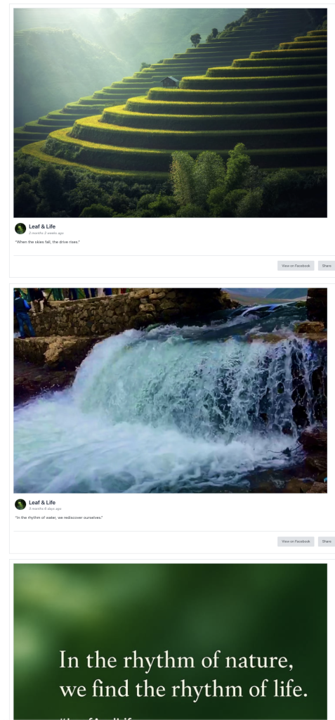
Full-Width Layout
Full-width layouts stretch across the entire container.
Best For:
- Homepage sections
- Landing pages
- Highlight sections
- Hero content areas
Benefits:
- High visibility
- Strong visual impact
- Great for announcements
If your theme supports wide containers, this layout stands out.
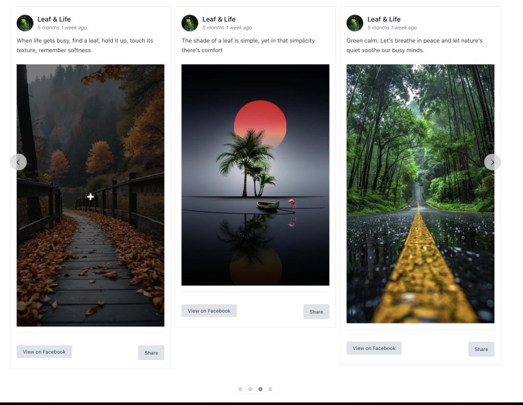
Carousel Layout
This layout is ideal for smaller spaces.
Best For:
- Sidebar widgets
- Footer areas
- Blog pages
Benefits:
- Space efficient
- Clean and minimal
- Keeps social presence visible
When using sidebar layouts, reduce columns and post count for better readability.
Managing Columns & Responsiveness
Within Layout Settings, you can control:
- Desktop columns
- Tablet columns
- Mobile columns
Best practice:
- 3–4 columns for desktop
- 2 columns for tablet
- 1 column for mobile
This ensures your feed remains responsive and user-friendly.
Using Different Layouts on Different Pages
One of the powerful features of Easy Social Feed is the ability to create multiple Skins.
This means you can:
- Use Grid on homepage
- Use Masonry on blog page
- Use Carousel layout in sidebar
- Use Full-width layout on landing page
Simply assign the correct Skin ID inside the shortcode.
Each Skin can have a different layout.
How to Choose the Right Layout for Your Website
Here’s a quick decision guide:
| Goal | Recommended Layout |
|---|---|
| Clean Instagram gallery | Grid |
| Modern blog style | Masonry |
| Homepage highlight | Full-width |
| Sidebar display | Compact grid |
| Product showcase | Grid with fewer columns |
Choose based on purpose, not just appearance.