
Your website visitors are not all using desktops.
They’re browsing on:
- Smartphones
- Tablets
- Laptops
- Large desktop screens
If your social feed looks perfect on desktop but broken on mobile, it can hurt your website’s design and user experience.
That’s why Easy Social Feed includes built-in responsive settings to ensure your Facebook and Instagram feeds adapt automatically to different screen sizes.
In this guide, we’ll explain:
- How responsiveness works
- How to control mobile layout
- Best practices for mobile design
- Free vs Pro responsive features
What Does “Responsive” Mean?
Responsive design means your social feed automatically adjusts based on screen size.
For example:
- 4 columns on desktop
- 2 columns on tablet
- 1 column on mobile
Images resize.
Spacing adjusts.
Content stacks vertically.
This ensures your feed looks clean on every device.
How Easy Social Feed Handles Responsiveness
Easy Social Feed is built to be mobile-friendly by default.
That means:
- Feeds automatically adapt to smaller screens
- Images scale properly
- Columns stack vertically
- Text remains readable
- Buttons stay accessible
You don’t need coding or extra plugins.
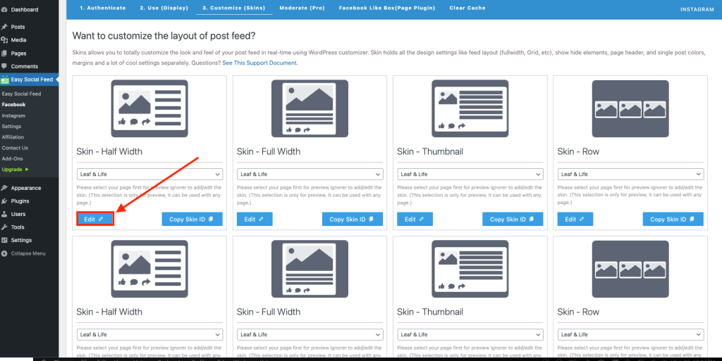
Where to Adjust Responsive Settings
To customize responsive behavior:
For Facebook:
Easy Social Feed → Facebook
For Instagram:
Easy Social Feed → Instagram
Inside the layout settings, you can adjust column structure and spacing.
In some versions, responsive column options are available directly inside the layout configuration.
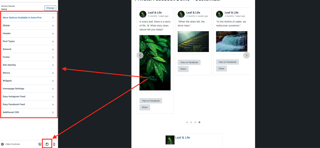
Adjusting Columns for Mobile
One of the most important responsive settings is column control.
Best practice:
- Desktop → 3–4 columns
- Tablet → 2 columns
- Mobile → 1 column
This prevents:
- Cramped layouts
- Overlapping content
- Tiny unreadable text
Spacing & Mobile Optimization
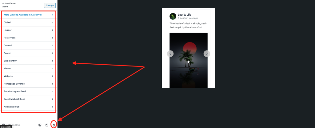
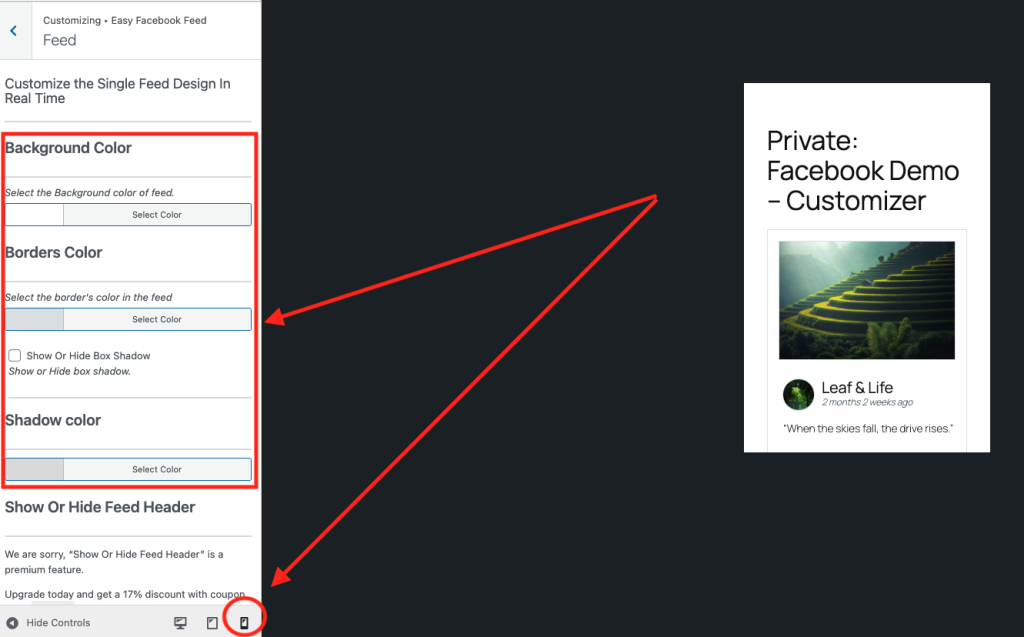
On mobile screens:
- Reduce column count
- Increase vertical spacing
- Keep text readable
- Avoid heavy borders
- Use simple layouts
A clean mobile layout increases engagement.
Responsive Images & Media
Easy Social Feed automatically:
- Scales images proportionally
- Adjusts video containers
- Maintains aspect ratio
- Supports lightbox viewing (if enabled)
This prevents broken layouts and distorted media.
How Carousel & Sliders Behave on Mobile (If Enabled)
If you’re using carousel-style layouts (Pro feature):
- Slides become swipe-friendly
- Navigation arrows adjust
- Touch gestures work naturally
This improves user interaction on smartphones.
Free vs Pro Responsive Features
Now, let’s clearly break down what’s available in each version.
Free Version Responsive Features
The Free version includes:
- Automatic responsive layout
- Basic column stacking
- Mobile-friendly image scaling
- Responsive grid layout
- Mobile-friendly Likebox display
For most simple websites, this is sufficient.
Pro Version Responsive Enhancements
The Pro version provides more advanced control, such as:
- Separate desktop, tablet, and mobile column settings
- Advanced layout behavior control
- Enhanced carousel responsiveness
- Better control over element visibility on different devices
- Advanced hover and interaction behavior
- Improved lightbox mobile optimization
Pro is especially useful for:
- Designers
- Agencies
- High-traffic websites
- E-commerce sites
- Pixel-perfect branding needs
Best Practices for Mobile Feed Design
To ensure your feed looks professional on mobile:
✔ Use 1 column for small screens
✔ Avoid too many posts in one view
✔ Keep spacing balanced
✔ Disable unnecessary elements
✔ Test on real devices
✔ Avoid heavy shadows and borders
Simple layouts perform better on mobile.
Common Mobile Issues & Fixes
Feed Looks Too Crowded?
- Reduce the number of columns
- Increase vertical spacing
Images Cropped Incorrectly?
- Adjust layout settings
- Check the theme container width
Buttons Too Small?
- Increase button padding
- Simplify layout
Why Mobile Optimization Is Critical
If your mobile design is poor:
- Users leave quickly
- Engagement drops
- Brand perception suffers
- SEO rankings may decline
Mobile-friendly feeds improve:
- User experience
- Time on site
- Social engagement
- Conversion rates
Final Thoughts
Easy Social Feed is responsive by default, meaning your feeds automatically adapt to all devices.
- The free version provides essential mobile responsiveness.
- Pro version unlocks advanced device-specific control and enhanced layout flexibility.
No coding.
No manual CSS.
Just smart responsive design built in.